Exploratory Data Analysis on the Yahoo Dating dataset
1 Abstract
This exploratory data analysis firstly provides a preliminary analysis of the data quality of the Yahoo Dating dataset. An executive summary is followed to explain the most important findings in this study. In the main analysis, it focuses on finding geographic characteristics and patterns on the users of Yahoo Dating as well as describe the processes. In the end, a conclusion is provided to wrap up the analysis, which leads to the limitations and future directions.
2 Introduction
Nowadays, with the development of Internet and the popularization of the computer, online dating is a growing and efficient way for people to meet potential partners, instead of the traditional method of relationship formation and communication. The selection of a partner reflects a combination of partner characteristics that the individual prefers. Consequently, preferences are particularly important for understanding the close relationship.
With the development of globalization, the flowing in of immigrants infuses the United States with diverse ethnicities, which gradually changes the racial boundaries and racial hierarchies in the country. Increasing evidence has shown strong racial homogamy in dating preferences among all ethnic groups (Joyner and Kao 2005). For instance, the previous study found that whites are more likely than non-whites to indicate preferences for dates’ body type (Pitzer et al. 2009) and whites are far more likely to date only within their ethnicity than minority groups, while minorities are more likely to include whites in their dating preferences (Robnett and Feliciano 2011). Gender plays another important role in differentiating the preference. Men are significantly more likely than women to “express a desire for specific body types, typically for thinner bodies over heavier ones (Kurzban and Weeden 2007).” Therefore, in line with the previous research, we are interested in looking at how online daters’ ethnicity and sex as a cross-impact that influences their preferences for choosing a dating mate. Specifically, we want to investigate whether ethnicity and sex differentiate peoples’ preferences on the other’s race, body types, education backgrounds and educational attainment.
200 profiles each from 18-50 years old self-identified Asian, Black, Latino or White heterosexual men and women from New York, Los Angeles, Chicago or Atlanta were collected and coded, for a total sample size of 6,070. The dataset provides abundant self-reported socio-demographic information about respondents, as well as their physical features. The original dataset is found on the website of ICPSR (Inter-University Consortium for Political and Social Research) of University of Michigan, Ann Arbor. Anyone who is interested in the raw dataset can refer to ICPSR No. 36347 on http://www.icpsr.umich.edu/.
Two authors, Zhifu Xiao and Peiwen Tang equally contribute to the paper. Zhifu Xiao focuses more on the layout, numerical exploratory data analysis, and write-up, while Peiwen Tang focuses more on the literature review, data visualization, and write-up.
3 Preliminary Analysis of Data Quality
In this section, we will provide a detailed, well-organized description of data quality, including textual description, graphs, and code. First, we want to know how many observations in the dataset don’t have a missing value in all columns. The results in shown below.
sum(ifelse(rowSums(is.na(data)) > 0, 0, 1))## [1] 0From the result, we could see that all entries have missing values in some columns, and what we want to see next is the missing patterns of the data.
3.1 Missing Patterns Analysis
visna(data)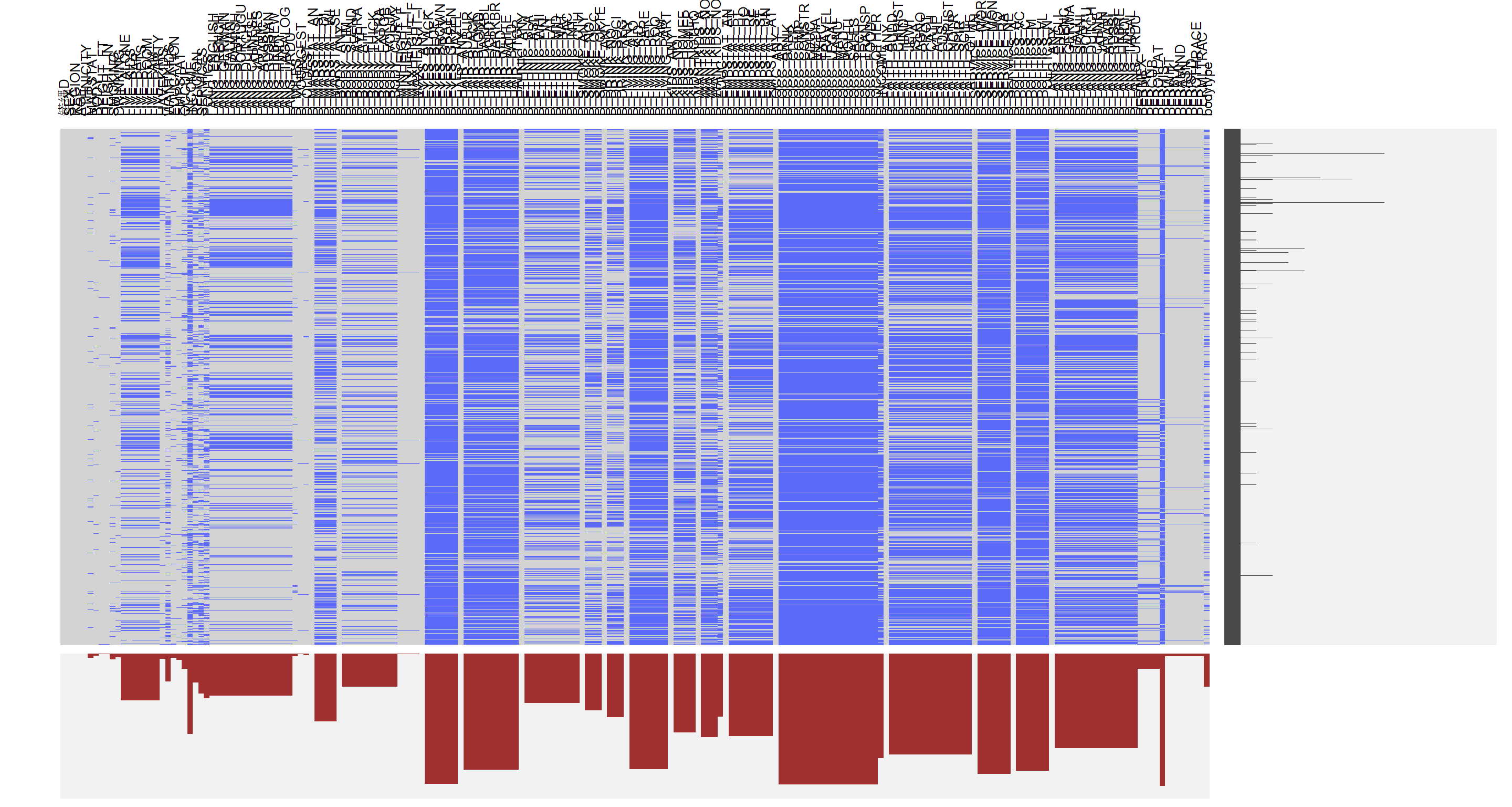
Although there are too many variables and we can’t see their individual description clearly, we could see the overall trends of missing pattern distribution. From the output, we could see that the first several variables are in good shape: most observations have those variables. From the graph, we could see that several chunks share similar missing data patterns and most of them have the same category. By looking at the description of the data, we could see that for a specific question, answers are stored in multiple columns. For example, there is a question about your marital status, and there are five columns indicating open to any status, open to single, open to divorced, open to widowed and open to separated. If a user prefers not to answer such question, all five columns will have a missing value. Thus, the first thing we could do is to group those columns together to make the graph more condensed.
#colnames(data)[1:42]
visna(data[1:42])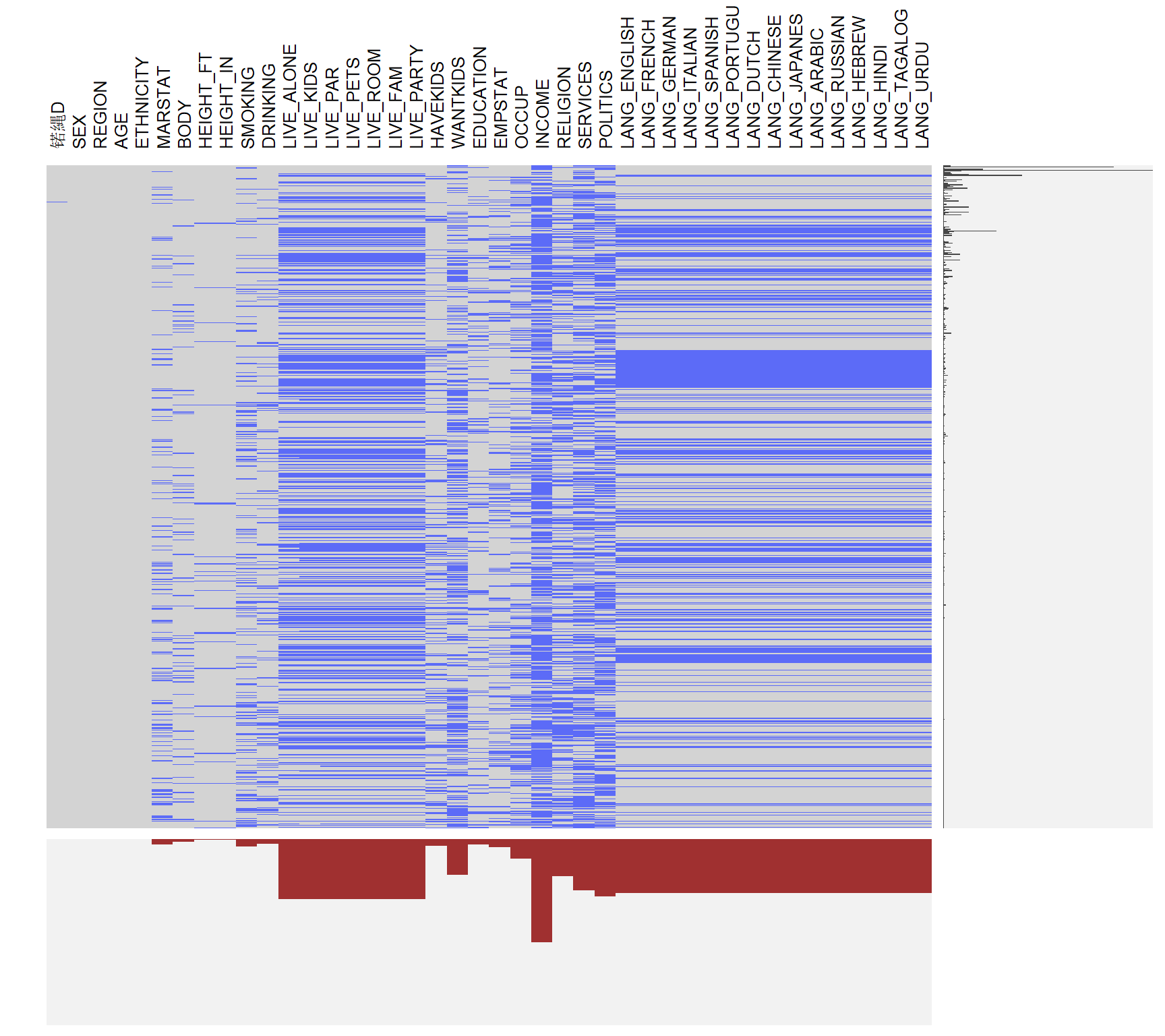
From the codebook of the dataset, we could discover that the first part is the information of the users. For example, DRINKING represents the frequency of drinking, while SERVICES represents the frequency of going to churches. Based on this information, we could describe a person based on this information. From the missing pattern plot for the first part of the data, we could see that most people don’t hide their basic information, like sex, age, height, etc. However, for some sensitive information, like income, politics, more people leave them as blank. For multiple entries, there is a pattern that if a person doesn’t fill out the first one (current living status), this person will be more likely to leave the second entries (Speaking language(s)) as blank, possibly because it is too complicated.
#colnames(data)[43:115]
visna(data[43:115])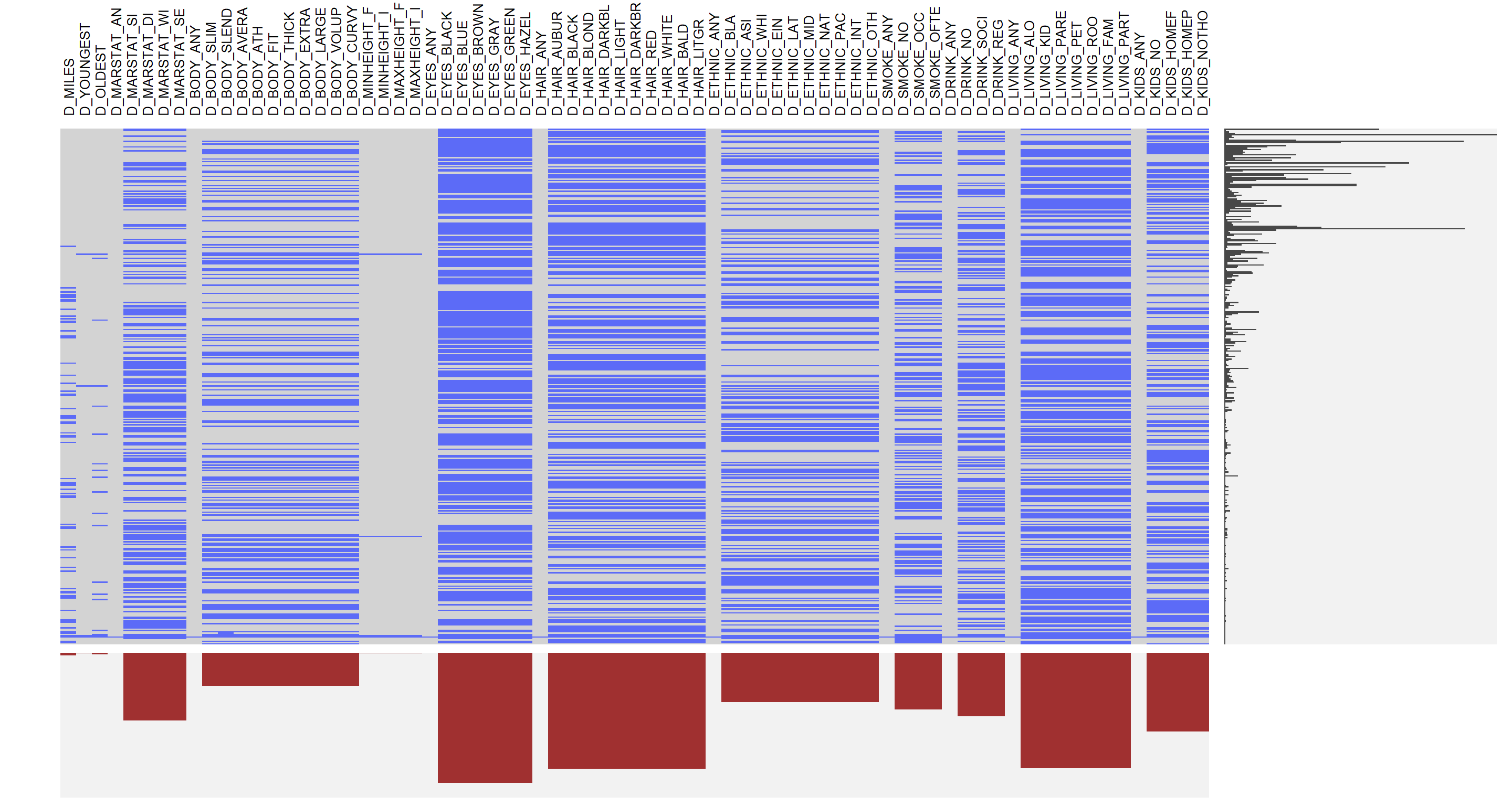
#colnames(data)[116:195]
visna(data[116:195])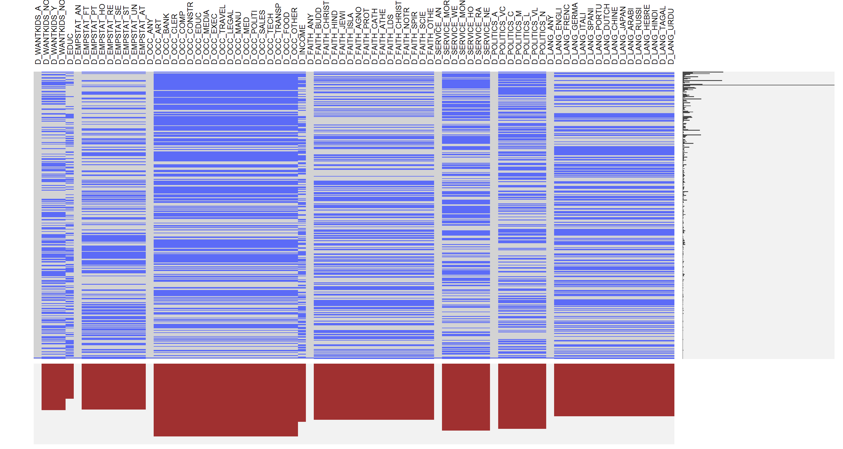
The second part of the data is their desired characteristics for potential partners. Note that the variables in the second part start with a letter D, and some of them have sub-categories, like MARSTAT, etc. It represents the certain characteristics from the first part. A user could select none, one, or multiple groups in that characteristic. For example, a person who earns between 50,000 and 74,999 dollars per year may choose the group of the annual income of $50,000-$74,999 as well as $75,000-$99,999. Thus, there are lots of missing values in those variables. Basically, we could split the second part of data into several groups: distance between themselves and potential partners, requirements in age, height, body type, marital status, eyes color, ethnic, smoke frequency, drinking frequency, current living, employment, whether they have kids and want to have kids, current occupation, income, beliefs, whether they go to church, and speaking language(s).
From the missing pattern plot, we could discover that several groups have a small gap in between. The reason is that the first variable in each group measures the response of the group: if a user selects at least one from the group, this indicator variable will be 1; if a user leaves all of them blank, then the indicator variable will be 0. As a result, there is no missing value for this indicator variable. In summary, we could see that the missing data on marital status, body type, ethnicity, smoke frequency and drinking frequency is significantly less than the other groups. It’s probably because that information is more important when dating with someone, rather than the color of hair and eye, the body type, smoke frequency and drinking frequency could be more important. We could see that the missing data in the second plot is more than that in the first plot, and it probably because people are getting tired filling that information and just decide to leave them blank. We will do a further examination in the main analysis.
3.2 Outlier Analysis
data$HEIGHT <- data$HEIGHT_FT * 30.48 + data$HEIGHT_IN * 2.54
p1 <- ggplot(data) +
  geom_histogram(binwidth = 2.5, aes(data$HEIGHT), fill = "lightskyblue") +labs(x = "Height") +
  theme(text = element_text(size=14))
p2 <- ggplot(data) +
  geom_histogram(binwidth = 1, aes(data$AGE), fill = "lightskyblue") +labs(x = "Age")  +
  theme(text = element_text(size=14))
grid.arrange(p1, p2, ncol = 1, top=textGrob("Distributions of Height and age", gp=gpar(fontsize=18)))
## Warning: Removed 29 rows containing non-finite values (stat_bin).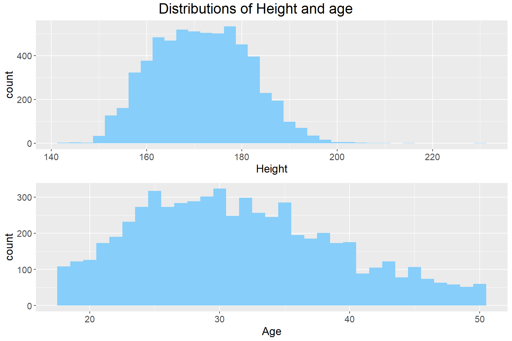
The next part we are going to look at is the quality of the data: we could discover that most of the variables are categorical variables, and there are only two variables that are discrete variables, which are height and age. Based on the univariate analysis, there is a single outlier on the higher end with around 230cm in height. There is no obvious outlier in the age variable. In summary, although there are lots of missing data in the dataset, there aren’t any further issues within the dataset, and we could ignore the missing data with care in the further analysis.
4 Executive Summary
attach(data)
d_body <- data.frame(D_BODY_ANY, SEX, ETHNICITY)
d_body <- d_body[complete.cases(d_body), ]
#sex1<- d_body$data.SEX
d_body$D_BODY_ANY <- factor(d_body$D_BODY_ANY, levels = c (0,1), labels = c("have preference","no preference"))
lb1 <- c("0" = "Black", "1" = "Asian", "2" = "White", "4" = "Latino")
p1 <- ggplot(d_body,mapping = aes(x = D_BODY_ANY, fill = factor(SEX))) + geom_bar (position = "dodge") + guides(fill = guide_legend(title = "SEX")) +labs(x = "Date Any Body Type") + scale_fill_viridis(discrete = TRUE, breaks = c(0,1), labels = c("female", "male")) + theme(text = element_text(size=14), axis.text.x = element_text(hjust = 1), plot.title = element_text(face = "bold", size = 14))
p2 <- ggplot(d_body,mapping = aes(x = D_BODY_ANY, fill = factor(ETHNICITY))) + geom_bar (position = "dodge") + guides(fill = guide_legend(title = "Ethnicity")) +labs(x = "Date Any Body Type") + scale_fill_viridis(discrete = TRUE, breaks = c(0,1,2,4), labels = c("Black", "Asian", "White", "Latino")) + theme(text = element_text(size=14), axis.text.x = element_text(hjust = 1), plot.title = element_text(face = "bold", size = 14))
attach(data)
body_pref <- data.frame(SEX, D_BODY_SLIM, D_BODY_SLENDER, D_BODY_AVERAGE, D_BODY_ATH, D_BODY_FIT, D_BODY_THICK, D_BODY_EXTRA, D_BODY_LARGE, D_BODY_VOLUP)
colnames(body_pref)[colnames(body_pref) == "D_BODY_SLIM"] <- "Slim"
colnames(body_pref)[colnames(body_pref) == "D_BODY_SLENDER"] <- "slender"
colnames(body_pref)[colnames(body_pref) == "D_BODY_AVERAGE"] <- "Average"
colnames(body_pref)[colnames(body_pref) == "D_BODY_ATH"] <- "Athletics"
colnames(body_pref)[colnames(body_pref) == "D_BODY_FIT"] <- "Fit"
colnames(body_pref)[colnames(body_pref) == "D_BODY_THICK"] <- "Thick"
colnames(body_pref)[colnames(body_pref) == "D_BODY_EXTRA"] <- "Extra"
colnames(body_pref)[colnames(body_pref) == "D_BODY_LARGE"] <- "Large"
colnames(body_pref)[colnames(body_pref) == "D_BODY_VOLUP"] <- "Voluptous"
body_pref <- melt(body_pref,id = c("SEX"))
body_pref <- body_pref[complete.cases(body_pref),]
p3 <- ggplot(body_pref, aes(x = variable, weight = value, fill = factor(SEX))) + geom_bar (position = "dodge") + theme(text = element_text(size=14), axis.text.x = element_text(angle = 30, hjust = 1), plot.title = element_text(face = "bold", size = 14)) + guides(fill = guide_legend(title = "SEX")) + labs(x = "Body Type Preference") + scale_fill_viridis(breaks = c(0,1), labels = c("female", "male"), discrete = TRUE)
grid.arrange (p1, p2, p3, top=textGrob("Barchart of body type preference", gp=gpar(fontsize=18)))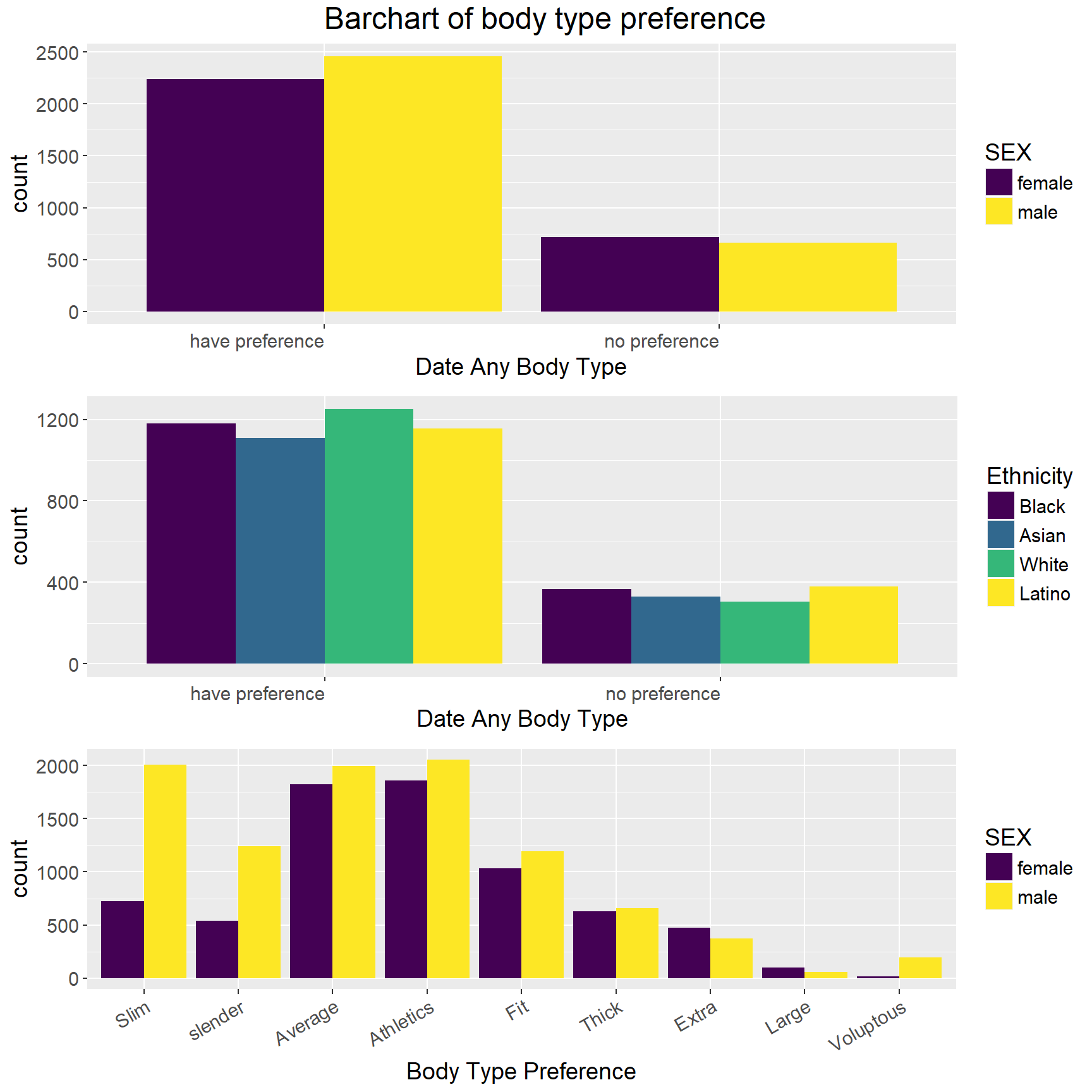 First, by using bar chart separated by sex, we figure out that more people have specific body preferences than those who do not, and more males tend to have body preferences than female do. Additionally, males are more likely to have a specific body type preference than do females.
The bar chart in the middle shows the distributions of body type preferences of different racial groups. We can notice from the graph that whites are more likely than non-whites to have a body type preference.
Finally, the bottom graph shows the differences of body type preference by gender. The bottom bar chart refers to the choices made by those who claimed they have body type preference for the first question, and there are many variations in the difference between males and females. The three most popular body types for men are athletics, slim and average whereas for women are athletics, average and fit. One distinct difference between men and women happens in slim body type.
attach(data)
d4 <- data.frame(data.frame(SEX, ETHNICITY, D_ETHNIC_BLACK, D_ETHNIC_ASIAN, D_ETHNIC_WHITE, D_ETHNIC_EINDIAN, D_ETHNIC_LATINO, D_ETHNIC_MIDEAST, D_ETHNIC_NATIVE, D_ETHNIC_PACIFIC, D_ETHNIC_INTER, D_ETHNIC_OTHER))
colnames(d4)[colnames(d4) == "D_ETHNIC_BLACK"] <- "Black"
colnames(d4)[colnames(d4) == "D_ETHNIC_ASIAN"] <- "Asian"
colnames(d4)[colnames(d4) == "D_ETHNIC_WHITE"] <- "White"
colnames(d4)[colnames(d4) == "D_ETHNIC_EINDIAN"] <- "East Indian"
colnames(d4)[colnames(d4) == "D_ETHNIC_LATINO"] <- "Latino"
colnames(d4)[colnames(d4) == "D_ETHNIC_MIDEAST"] <- "Middle Easten"
colnames(d4)[colnames(d4) == "D_ETHNIC_NATIVE"] <- "Native American"
colnames(d4)[colnames(d4) == "D_ETHNIC_PACIFIC"] <- "Pacific"
colnames(d4)[colnames(d4) == "D_ETHNIC_INTER"] <- "Inter-Racial"
colnames(d4)[colnames(d4) == "D_ETHNIC_OTHER"] <- "Other"
d4 <- melt(d4,id = c("SEX", "ETHNICITY"))
d4 <- d4[complete.cases(d4),]
#labels = c("D_ETHNIC_BLACK" = "Black", "D_ETHNIC_ASIAN" = "Asian", "D_ETHNIC_WHITE" = "White", "D_ETHNIC_EINDIAN" = "DateEastIndian", "D_ETHNIC_MIDEAST" = "Middle Easten", "D_ETHIC_LATINO" = "Latino", "D_ETHNIC_NATIVE" = "Native American", "D_ETHNIC_INTER" ="Inter-Racial", "8" = "Voluptous")
lb1 <- c("0" = "Black", "1" = "Asian", "2" = "White", "4" = "Latino")
ggplot(d4, mapping = aes(x = variable, weight = value, fill = factor(SEX))) + geom_bar(position = "dodge") + facet_grid(ETHNICITY ~ ., labeller = as_labeller(lb1)) + theme(text = element_text(size=14), axis.text.x = element_text(angle = 30, hjust = 1), plot.title = element_text(face = "bold", size = 18)) + guides(fill = guide_legend(title = "Sex")) + labs(x = "Ethnicity Preference") + scale_fill_viridis(breaks = c(0,1), labels = c("female", "male"), discrete = TRUE)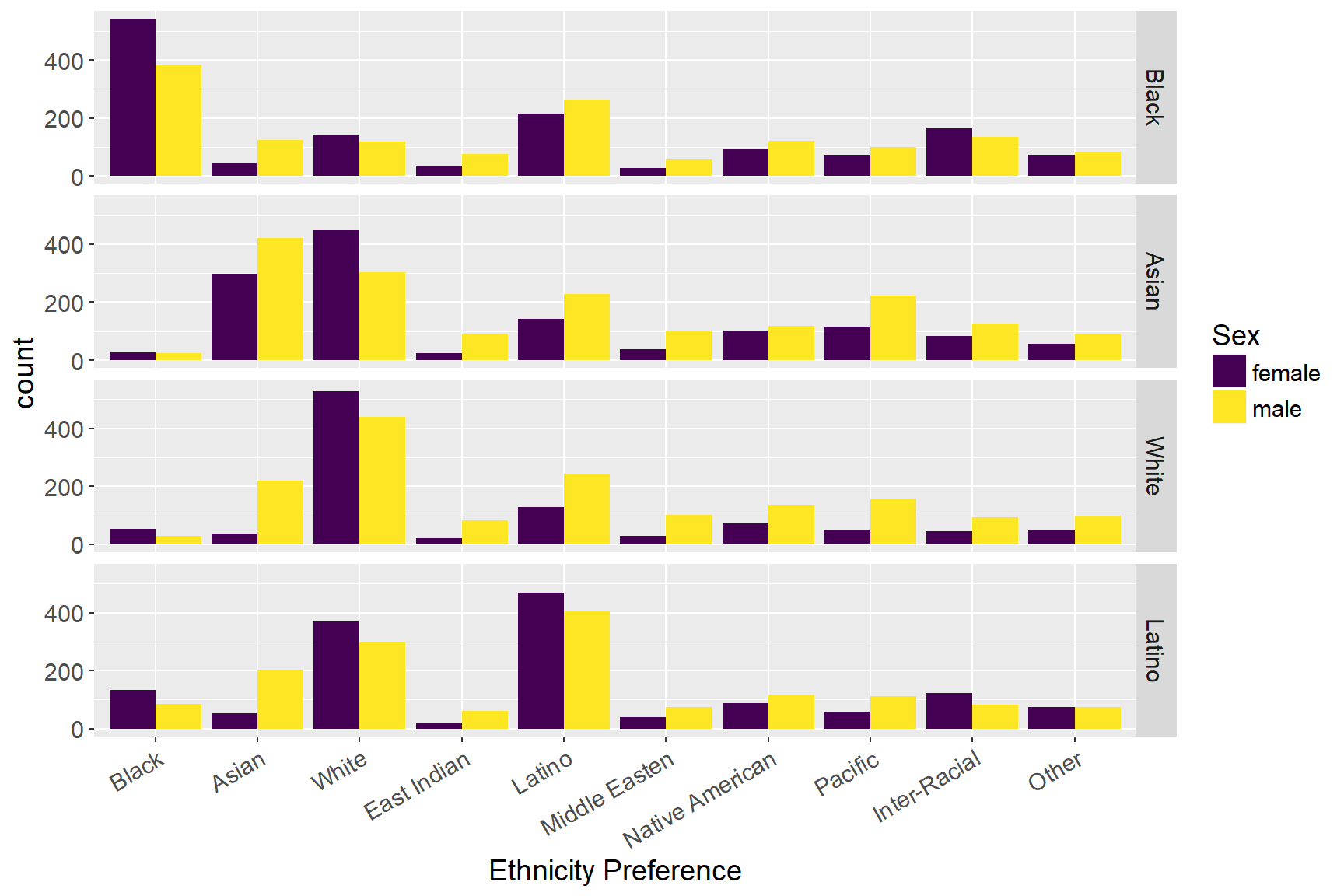
revalue(factor(ETHNICITY), c("0" = "Black", "1" = "Asian")) + ggtitle("Barcharts of Ethnicity Preferences by Races")## Warning in Ops.factor(revalue(factor(ETHNICITY), c(`0` = "Black", `1` =
## "Asian")), : '+' not meaningful for factorsIn line with previous research, we use the current dataset to examine if there exist ethnicity preferences. First, from the graph, we can find that most people prefer to choose their mates within same ethnicity group, and females have a higher preference than males to make such preference. Also, the graph also suggests that whites are far more likely to have racial exclusion than non-whites, which means that they prefer to date only with people who are in the same racial groups. Asians and Latinos, on the other hand, are more likely to include whites as their dating choices than do whites. Furthermore, the results also show that Asian females and Latino females are more likely to include whites as their potential dates than do males. Consistent with prior studies, for white online daters, race is one of the major selection criteria. However, gender distinguishes this standard, as white women are far more likely than white men to have white-exclusive dating preference. On the other hand, Asian online daters show a different pattern with whites, as more Asian women than Asian men to be more open to date non-Asians.
attach(data)
d5 <- data.frame(data.frame(EDUCATION, INCOME, D_INCOME, D_EDUC))
d5 <- melt(d5, id = c("EDUCATION", "INCOME", "D_INCOME", "D_EDUC"), na.rm = TRUE)
Freq <- 1
d5 <- cbind(d5, Freq)
sum_d5 <- aggregate(d5$Freq, by=list(d5$EDUCATION, d5$INCOME, d5$D_INCOME, d5$D_EDUC), FUN=sum)

sum_d5$Group.1 <- as.factor(sum_d5$Group.1)
sum_d5$Group.2 <- as.factor(sum_d5$Group.2)
sum_d5$Group.3 <- as.factor(sum_d5$Group.3)
sum_d5$Group.4 <- as.factor(sum_d5$Group.4)
sum_d5$Group.1 <- revalue(sum_d5$Group.1, c("0" = "0: Some high school", "1" = "1: High school graduate", "2" = "2: Some college", "3" = "3: College graduate", "4" = "4: Post_graduate"))
sum_d5$Group.2 <- revalue(sum_d5$Group.2, c("0" = "0: <$25,000", "1" = "1: $25,000-$34,999", "2" = "2: $35,000-$49,999", "3" = "3: $50,000-$74,999", "4" = "4: $75,000-$99,999", "5" = "5: $100,000-$149,999", "6" = "6: >$150,000"))
sum_d5$Group.3 <- revalue(sum_d5$Group.3, c("0" = "0: <$25,000", "1" = "1: $25,000-$34,999", "2" = "2: $35,000-$49,999", "3" = "3: $50,000-$74,999", "4" = "4: $75,000-$99,999", "5" = "5: $100,000-$149,999", "6" = "6: >$150,000"))
sum_d5$Group.4 <- revalue(sum_d5$Group.4, c("0" = "0: Some high school", "1" = "1: High school graduate", "2" = "2: Some college", "3" = "3: College graduate", "4" = "4: Post_graduate"))

colnames(sum_d5) <- c("Education", "Income", "Desired_income", "Desired_education", "Freq")
alluvial(sum_d5[1:4], freq = sum_d5$Freq, hide = sum_d5$Freq < 3, cex = 0.75, alpha=0.7,
         gap.width=0.1, col= ifelse(sum_d5$Desired_income == sum_d5$Income | sum_d5$Education == sum_d5$Desired_education, "pink", "lightskyblue"), border = ifelse(sum_d5$Desired_income == sum_d5$Income | sum_d5$Education == sum_d5$Desired_education, "pink", "lightskyblue"), title = "Alluvial Diagrams of education status and income categories", ylim_offset= c(-0.025, 0.01), xlim_offset= c(-0.15, 0.15))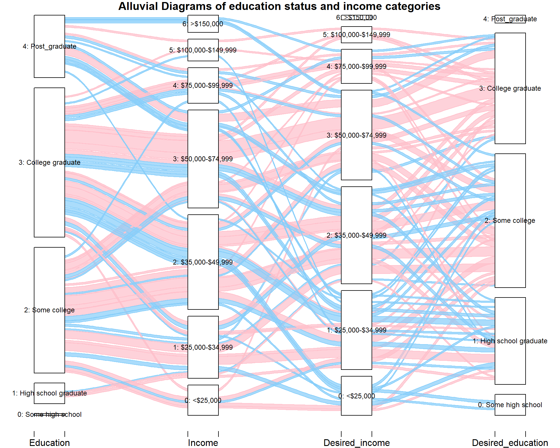
The graph above represents the education status and income category of a user as well as their desired income category and education status of dating mate. We colored the group the same education status or the same income category between themselves and dating mate in red. From the plot, we could see that for high school graduate and post graduate, there is only one-fourth of them choosing to stick with their status. It probably because they want to open their views to a broader audience. For users with some college experience and graduated from college, there are more than half of them choosing to stick with their status, which is reasonable. For income categories, people in the highest income category (earning more than $150,000 dollars per year) seems to not care about being in the same categories that much: almost none of them prefer a dating mate in the same income category or education status. It probably because there are fewer data points, or because they care more about other aspects. For desired income of the dating mate, the third category: annual income between $50,000 and $74,999 dollars seems to be very popular among users with similar status, while the first category: annual income less than $25,000 dollars seems to not very popular among people that have less income or similar social status. In summary, though there are some patterns in education status, income categories and their expected income and education status, generally people care less about their dating mate’s income that much, compared to other factors such as body type before.
5 Main Analysis
In the main analysis, we are going to discuss our approaches in addition to the executive summary in three perspectives: speaking language(s), ethnicity and body type.
5.1 Analysis on Speaking Languages
Throughout those variables, the variables involving with language is the only type of variables that the users could make multiple selections on themselves as well as their desired partners. Thus, we did a univariate analysis on these variables, and the results are shown below.
LANG <- c("LANG_ENGLISH", "LANG_FRENCH", "LANG_GERMAN", "LANG_ITALIAN", "LANG_SPANISH", "LANG_PORTUGUESE", "LANG_DUTCH", "LANG_CHINESE", "LANG_JAPANESE", "LANG_ARABIC", "LANG_RUSSIAN", "LANG_HEBREW", "LANG_HINDI", "LANG_TAGALOG", "LANG_URDU")
D_LANG <- c("D_LANG_ENGLISH", "D_LANG_FRENCH", "D_LANG_GERMAN", "D_LANG_ITALIAN", "D_LANG_SPANISH", "D_LANG_PORTUGUESE", "D_LANG_DUTCH", "D_LANG_CHINESE", "D_LANG_JAPANESE", "D_LANG_ARABIC", "D_LANG_RUSSIAN", "D_LANG_HEBREW", "D_LANG_HINDI", "D_LANG_TAGALOG", "D_LANG_URDU")
LIVE <- c("LIVE_ALONE", "LIVE_KIDS", "LIVE_PAR", "LIVE_PETS", "LIVE_ROOM", "LIVE_FAM", "LIVE_PARTY")
D_POLITICS <- c("D_POLITICS_VCONS", "D_POLITICS_CONS", "D_POLITICS_MIDDLE", "D_POLITICS_LIB", "D_POLITICS_VLIB", "D_POLITICS_NOTPOL")

sum_LANG <- as.data.frame(table(rowSums(data[LANG], na.rm = TRUE)))
sum_D_LANG <- as.data.frame(table(rowSums(data[D_LANG], na.rm = TRUE)))
sum_LANG_2 <- melt(data.frame(data[LANG]))
sum_D_LANG_2 <- melt(data.frame(data[D_LANG]))
sum_LANG_2 <- aggregate(sum_LANG_2$value, by=list(Category=sum_LANG_2$variable), FUN=sum, na.rm = TRUE)
sum_D_LANG_2 <- aggregate(sum_D_LANG_2$value, by=list(Category=sum_D_LANG_2$variable), FUN=sum,  na.rm = TRUE)
sum_LANG_2$Category <- c("English", "French", "German", "Italian", "Spanish", "Portuguese", "Dutch", "Chinese",
                         "Japanese", "Arabic", "Russian", "Hebrew", "Hindi", "Tagalog", "Urdu")
sum_D_LANG_2$Category <- c("English", "French", "German", "Italian", "Spanish", "Portuguese", "Dutch", "Chinese",
                           "Japanese", "Arabic", "Russian", "Hebrew", "Hindi", "Tagalog", "Urdu")
sum_LANG_2 <- transform(sum_LANG_2, Category = reorder(Category, -x))
sum_D_LANG_2 <- transform(sum_D_LANG_2, Category = reorder(Category, -x))

p1 <- ggplot(sum_LANG) +
  geom_bar(aes(x = as.numeric(levels(sum_LANG$Var1)), weight = sum_LANG$Freq), fill = "lightskyblue") +labs(x = "Number of Language(s) the user could speak") + theme(text = element_text(size=12))
p2 <- ggplot(sum_D_LANG) +
  geom_bar(aes(x = as.numeric(levels(sum_D_LANG$Var1)), weight = sum_D_LANG$Freq), fill = "lightskyblue") +labs(x = "Number of Language(s) would like the partner to speak") + theme(text = element_text(size=12))
p3 <- ggplot(sum_LANG_2) +
  geom_bar(aes(x = sum_LANG_2$Category, weight = sum_LANG_2$x), fill = "lightskyblue") +labs(x = "Type of Language(s) the user could speak") + theme(text = element_text(size=12), axis.text.x = element_text(angle = 30, hjust = 1))
p4 <- ggplot(sum_D_LANG_2) +
  geom_bar(aes(x = sum_D_LANG_2$Category, weight = sum_D_LANG_2$x), fill = "lightskyblue") +labs(x = "Type of Language(s) would like the partner to speak") + theme(text = element_text(size=12), axis.text.x = element_text(angle = 30, hjust = 1))
grid.arrange(p1, p2, p3, p4, ncol = 2, top=textGrob("Univariate analysis of the language variables",gp=gpar(fontsize=16)))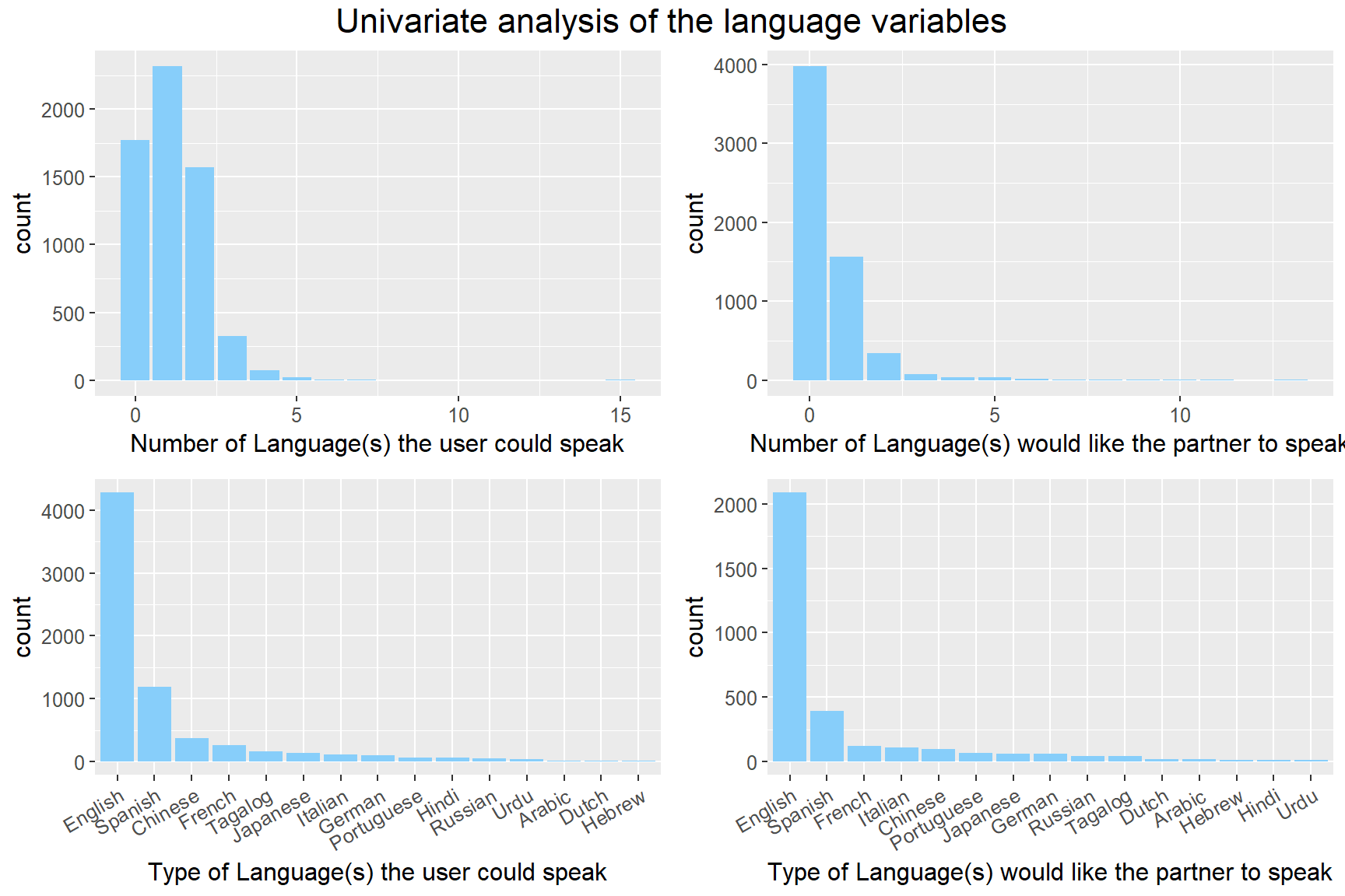
From the plot, we could see that there are quite a few people didn’t select any of the languages. It probably because they are tired of choosing between many options. Among the users that select at least one language, three are two-thirds could speak another language. However, they seem to don’t care whether their potential partner could speak a second language from the top right plot. Although it is invisible from the plot, there is an outlier that select all 15 languages in the top left plot, and it probably because of some errors or testing. Among 15 languages, English is undoubtedly the most popular language, and the second popular language is Spanish. Interestingly, Chinese is the third popular languages among users, but it only ranks fifth in the desired languages of their potential partner, and it probably because that the users who could speak Chinese are more interested in the people that cannot speak Chinese. We did a further examination on Chinese in an alluvial diagram to see what is the actual situation.
matrix <- matrix(0, 15, 15)
for (i in 1:15){
  for (j in 1:15) {
    matrix[j,i] <- sum(data[LANG[i]] == 1 & data[D_LANG[j]] == 1, na.rm = TRUE)
  }
}
matrix = data.matrix(matrix)
colnames(matrix) <- LANG
rownames(matrix) <- D_LANG
melt_matrix = melt(matrix)
levels(melt_matrix$X2) <- c("Arabic", "Chinese", "Dutch", "English", "French", "German", "Hebrew", "Hindi", "Italian", "Japanese", "Portuguese", "Russian", "Spanish", "Tagalog", "Urdu")
levels(melt_matrix$X1) <- c("Arabic", "Chinese", "Dutch", "English", "French", "German", "Hebrew", "Hindi", "Italian", "Japanese", "Portuguese", "Russian", "Spanish", "Tagalog", "Urdu")
alluvial(melt_matrix[2:1], freq = melt_matrix$value, hide = melt_matrix$value < 1, cex = 1,
         alpha=0.7, gap.width=0.25, col= ifelse(melt_matrix$X2 == "Chinese" | melt_matrix$X1 == "Chinese", "red", "grey"), border=ifelse(melt_matrix$X2 == "Chinese" | melt_matrix$X1 == "Chinese", "red", "grey"), axis_labels = c("Speak language(s)", "Desired language(s)"), title = "Alluvial Diagrams on speaking languages", ylim_offset= c(-0.01, 0.01))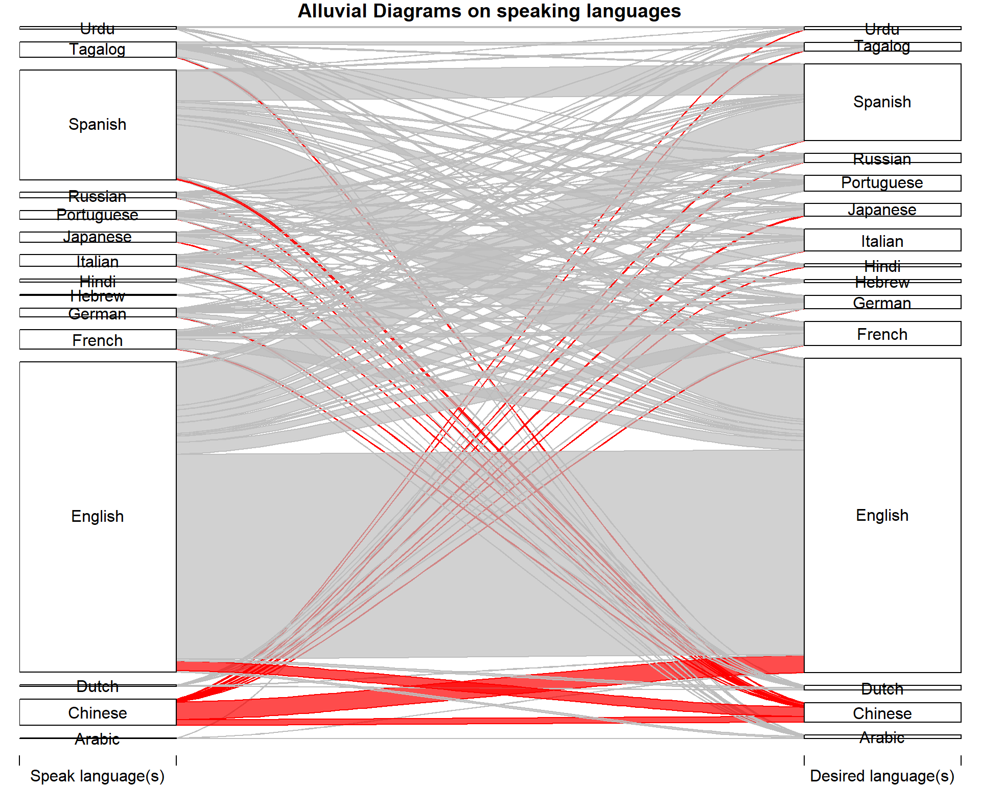
In this alluvial diagram, we could find that for Chinese-speaking users, more than three-fourths of them choose English as the language of their potential partners, and only one-fifth of them choose Chinese. Compared to other users, this ratio is relatively low. From the size, we could see that there is a net loss between Chinese and English, which means that more Chinese-speaking users choose English as the speaking language of their potential partners than English-speaking users choose Chinese as the speaking language of their potential partners. Among other languages, there is at least one-third of them sticking with their languages, while for Chinese, only one-fifth of them do so. It could be an interesting topic to do some further examination beyond this dataset.
5.2 Analysis on Ethnicity
attach(data)
d1 <- data.frame(data.frame(SEX, ETHNICITY, D_BODY_SLIM, D_BODY_SLENDER, D_BODY_AVERAGE, D_BODY_ATH, D_BODY_FIT, D_BODY_THICK, D_BODY_EXTRA, D_BODY_LARGE, D_BODY_VOLUP))
colnames(d1)[colnames(d1) == "D_BODY_SLIM"] <- "Slim"
colnames(d1)[colnames(d1) == "D_BODY_SLENDER"] <- "slender"
colnames(d1)[colnames(d1) == "D_BODY_AVERAGE"] <- "Average"
colnames(d1)[colnames(d1) == "D_BODY_ATH"] <- "Athletics"
colnames(d1)[colnames(d1) == "D_BODY_FIT"] <- "Fit"
colnames(d1)[colnames(d1) == "D_BODY_THICK"] <- "Thick"
colnames(d1)[colnames(d1) == "D_BODY_EXTRA"] <- "Extra"
colnames(d1)[colnames(d1) == "D_BODY_LARGE"] <- "Large"
colnames(d1)[colnames(d1) == "D_BODY_VOLUP"] <- "Voluptous"
d1 <- melt(d1,id = c("SEX", "ETHNICITY"))
d1 <- d1[complete.cases(d1),]
lb1 <- c("0" = "Black", "1" = "Asian", "2" = "White", "4" = "Latino")
lb2 <- c("0" = "Female", "1" = "Male")
ggplot(d1, mapping = aes(x = variable, weight = value, fill = factor(ETHNICITY))) + geom_bar (position = "dodge") + facet_grid(ETHNICITY ~ SEX, labeller = labeller(ETHNICITY = as_labeller(lb1), SEX = as_labeller(lb2))) + theme(text = element_text(size=14), axis.text.x = element_text(angle = 30, hjust = 1), plot.title = element_text(face = "bold", size = 18)) + guides(fill = guide_legend(title = "ETHNICITY")) + labs(x = "Body Type Preference") + scale_fill_viridis(discrete = TRUE, breaks = c(0,1,2,4), labels = c("Black", "Asian", "Caucasian", "Latino")) + ggtitle("Barchart of body type preference by gender and ethnicity")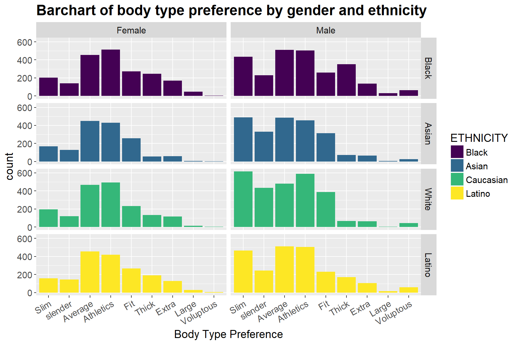 We also look at whether people with different races have different body type preferences. From the bar chart above we can notice that while there is not much variation in women of different ethnicities, men do have some differences in their preferences. While Asian and Caucasian males prefer slim females the most, Latino and Black males prefer average body type. Moreover, Black males prefer thick body type far more than any other ethnicities, and white men are more likely to choose to date women with fit or slender body types, compared to other races.
Furthermore, there is also variation between genders. For example, while Black, Asian and White males are more likely than females to prefer fit body type, Latino men are less likely than Latino women to do so, which is opposite. In general, males have a much higher preference for slim and slender body type than women do, and such distinction tends to be the largest among Asian groups.
5.3 Analysis on Body Type
attach(data)
d2 <- data.frame(data.frame(SEX, BODY, D_BODY_SLIM, D_BODY_SLENDER, D_BODY_AVERAGE, D_BODY_ATH, D_BODY_FIT, D_BODY_THICK, D_BODY_EXTRA, D_BODY_LARGE, D_BODY_VOLUP))
colnames(d2)[colnames(d2) == "D_BODY_SLIM"] <- "Slim"
colnames(d2)[colnames(d2) == "D_BODY_SLENDER"] <- "slender"
colnames(d2)[colnames(d2) == "D_BODY_AVERAGE"] <- "Average"
colnames(d2)[colnames(d2) == "D_BODY_ATH"] <- "Athletics"
colnames(d2)[colnames(d2) == "D_BODY_FIT"] <- "Fit"
colnames(d2)[colnames(d2) == "D_BODY_THICK"] <- "Thick"
colnames(d2)[colnames(d2) == "D_BODY_EXTRA"] <- "Extra"
colnames(d2)[colnames(d2) == "D_BODY_LARGE"] <- "Large"
colnames(d2)[colnames(d2) == "D_BODY_VOLUP"] <- "Voluptous"
d2 <- melt(d2,id = c("SEX", "BODY"))
d2 <- d2[complete.cases(d2),]
lb2 <- c("0" = "Female", "1" = "Male")
lb3 <- c("0" = "Slim", "1" = "Slender", "2" = "Average", "3" = "Athletic", "4" = "Fit", "5" = "Thick", "6" = "A few extra pounds", "7" ="large", "8" = "Voluptous")
ggplot(d2, mapping = aes(x = variable, weight = value, fill = factor(BODY))) + geom_bar (position = "dodge") + facet_grid(BODY ~ SEX, labeller = labeller(SEX = as_labeller(lb2), BODY = as_labeller(lb3)), scales = "free_y") + theme(plot.title = element_text(face = "bold", size = 18, hjust = 0.5), text = element_text(size=14), axis.text.x = element_text(angle = 30, hjust = 1), strip.text.y = element_blank()) + guides(fill = guide_legend(title = "BODY")) + labs(x = "Body Type Preference") + scale_fill_viridis(breaks = c(0,1,2,3,4,5,6,7,8), labels = c("slim", "slender", "average", "athletics", "fit", "thick", "a few extra pounds", "large", "voluptous"), discrete=TRUE) + ggtitle("Barchart of body type preferences by \n users' own body type")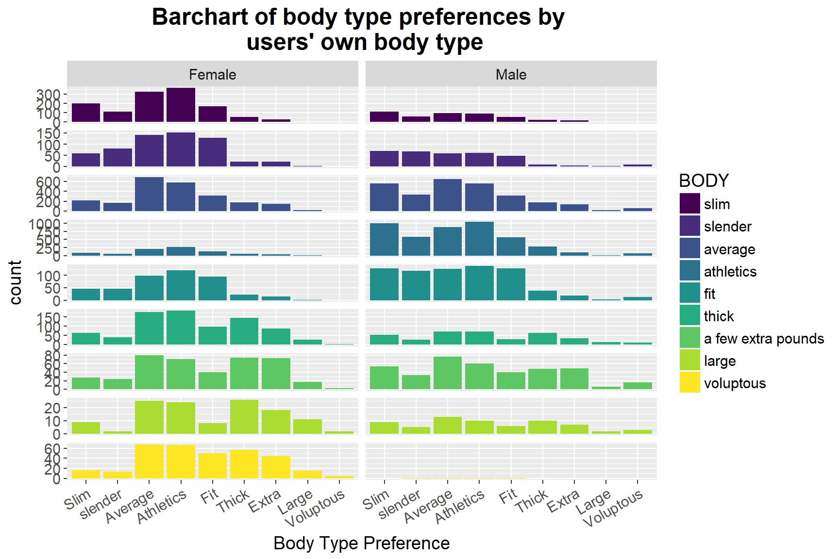
We further examine how sex and dating mates’ body types influence their preferences of their daters’ body types. From the above graph, we can notice a clear difference between the distribution of body type preferences between males and females. In general, females prefer to date males with average and athletics body types, whereas males want to date with women with slim, average or athletic body types, which is consistent with our previous findings. More specifically, there is evidence of the trend that the “larger” the women’s body type as she claimed, the higher possibility that she prefers to date with men of larger body types. Such pattern can also be found in the male group.
However, other significant variation cannot be directly seen from the graph, which suggests that Internet daters’ body type may not have had much influence on their preferences of choosing the other’s body type.
attach(data)
d3 <- data.frame(data.frame(INCOME, ETHNICITY, D_BODY_SLIM, D_BODY_SLENDER, D_BODY_AVERAGE, D_BODY_ATH, D_BODY_FIT, D_BODY_THICK, D_BODY_EXTRA, D_BODY_LARGE, D_BODY_VOLUP))
colnames(d3)[colnames(d3) == "D_BODY_SLIM"] <- "Slim"
colnames(d3)[colnames(d3) == "D_BODY_SLENDER"] <- "slender"
colnames(d3)[colnames(d3) == "D_BODY_AVERAGE"] <- "Average"
colnames(d3)[colnames(d3) == "D_BODY_ATH"] <- "Athletics"
colnames(d3)[colnames(d3) == "D_BODY_FIT"] <- "Fit"
colnames(d3)[colnames(d3) == "D_BODY_THICK"] <- "Thick"
colnames(d3)[colnames(d3) == "D_BODY_EXTRA"] <- "Extra"
colnames(d3)[colnames(d3) == "D_BODY_LARGE"] <- "Large"
colnames(d3)[colnames(d3) == "D_BODY_VOLUP"] <- "Voluptous"
d3 <- melt(d3,id = c("ETHNICITY", "INCOME"))
#INCOME[d3$INCOME == 98] <- NA
d3 <- d3[complete.cases(d3),]
lb1 <- c("0" = "Black", "1" = "Asian", "2" = "White", "4" = "Latino")
#lb4 <- c("0" = "<$24,999","1" = "$25,000-$34,999","2" = "$35,000-$49,999","3" = "$50,000-$74,999","4" = "$75,000-$99,999","5" = "$100,000-$149,999","6" = ">$150,000")
ggplot(d3, mapping = aes(x = variable, weight = value, fill = factor(INCOME))) + geom_bar (position = "dodge") + facet_grid(INCOME ~ ETHNICITY, labeller = labeller(ETHNICITY = as_labeller(lb1)), scales = "free_y") + theme(plot.title = element_text(face = "bold", size = 18, hjust = 0.5), text = element_text(size=14), strip.text.y = element_blank()) + guides(fill = guide_legend(title = "Income Range")) + labs(x = "Body Type Preference") + scale_fill_viridis(discrete = TRUE, breaks = c(0,1,2,3,4,5,6), labels = c("<$24,999", "$25,000-$34,999", "$35,000-$49,999", "$50,000-$74,999", "$75,000-$99,999", "$100,000-$149,999", ">$150,000")) + scale_x_discrete(breaks = seq(0,8,2))+ggtitle("Barchart of body type preference with distribution of \n income range by ethnicity ")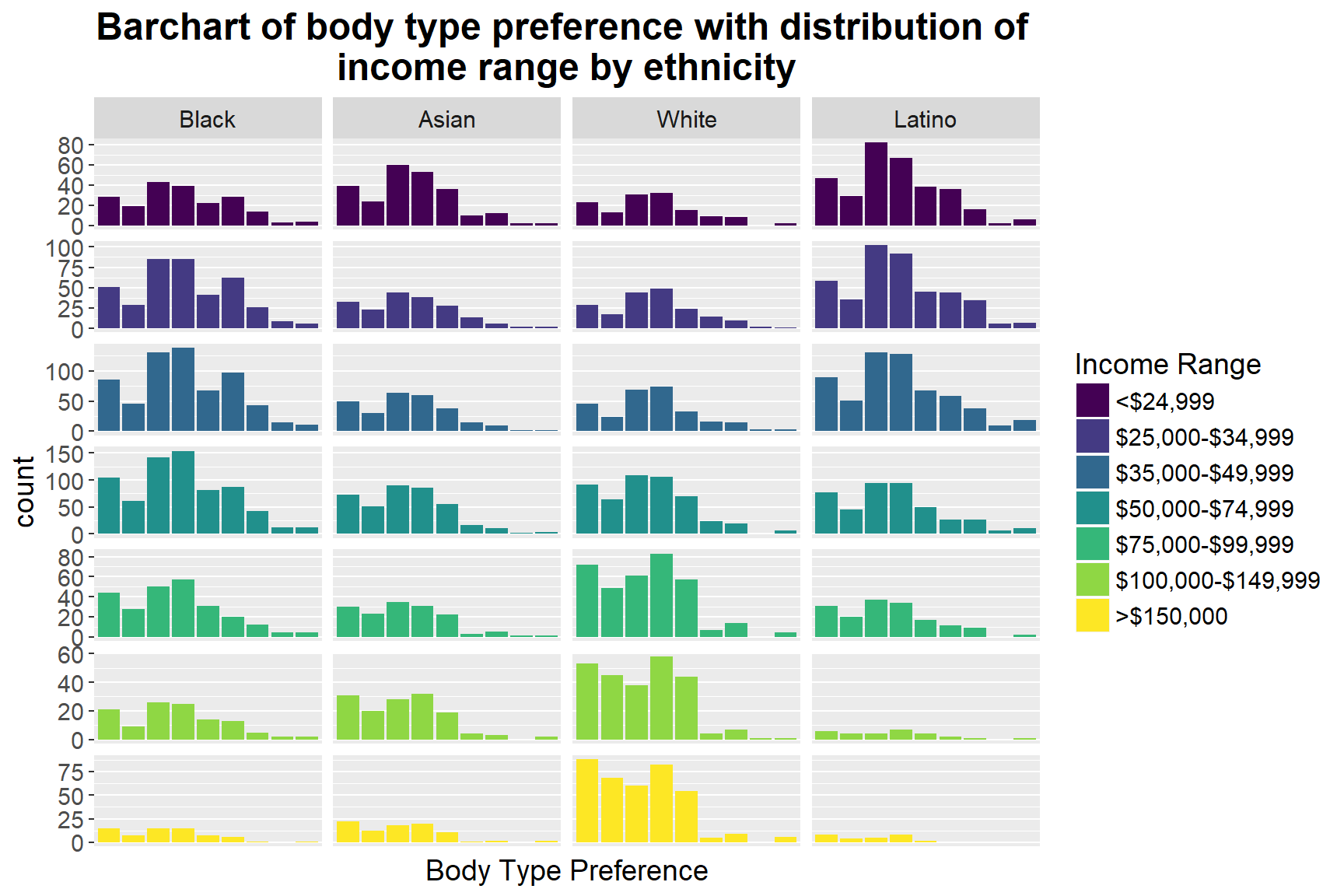
We then take a further step to highlight the income range in each ethnicity group to see whether it influences people’s different preferences. In the graph above, we can first spot that, for those whose income range is below $74,999, ethnicity doesn’t predict different dating choices: more people in this income range (< $ 74,999) prefer average and athletics body type, regardless of their ethnicity groups. However, for people whose income is larger than $75,000, some variation takes place in different races. For example, for Caucasians who earn more than $75,000, their preferences change to slim and athletic body types, whereas African American remains unchanged, and Asians first move to slim and average then slim and athletics. Nevertheless, there is no clear pattern of distinct body type preferences among different income range, which implies that income range may not be the main influence on dating mates’ body type preference.
6 Summary, Limitation and Further Direction
In this exploratory data analysis on the Yahoo Dating dataset, we first use the current dataset to replicate previous findings that whites more likely to have racial preferences than non-whites, and males and whites are significantly more likely to have body type preferences than females and non-whites. We then look at whether language is a key factor that influences people’s dating choices. By using an alluvial diagram, we find out that Chinese-speakers are significantly more likely to choose a partner who speaks English than those who speak Chinese, compared to other language speakers. Finally, we go on looking more specifically on how online daters’ body types and income ranges affect their dating preferences.
The current project has several limitations. The first potential limitation is that the sample contains only people who are willing to choose to date online. These data are likely to misrepresent individuals of low socio-economic status and others who may not have as much access to computers. Therefore, some social groups or subcultures may be excluded. Second, using online daters’ self-reported profiles may be inaccurate, since daters are likely to present themselves in the best possible light and might be willing to fabricate information. For example, some daters might lie about their age or body type to try to appear more desirable to potential dates. Additionally, the current work only examines, and presents exploratory findings, more sophisticated analysis and modeling need to be conducted if detailed relationships among each variable are to be examined. Future directions can focus on how other variables influences males and females different dating preferences, such as age, education attainment, etc.
Reference
Joyner, Kara, and Grace Kao. 2005. “Interracial Relationships and the Transition to Adulthood.” American Sociological Review 70 (4). Sage Publications: 563–81.
Kurzban, Robert, and Jason Weeden. 2007. “Do Advertised Preferences Predict the Behavior of Speed Daters?” Personal Relationships 14 (4). Wiley Online Library: 623–32.
Pitzer, Virginia E, Cécile Viboud, Lone Simonsen, Claudia Steiner, Catherine A Panozzo, Wladimir J Alonso, Mark A Miller, et al. 2009. “Demographic Variability, Vaccination, and the Spatiotemporal Dynamics of Rotavirus Epidemics.” Science 325 (5938). American Association for the Advancement of Science: 290–94.
Robnett, Belinda, and Cynthia Feliciano. 2011. “Patterns of Racial-Ethnic Exclusion by Internet Daters.” Social Forces 89 (3). Oxford University Press: 807–28.
